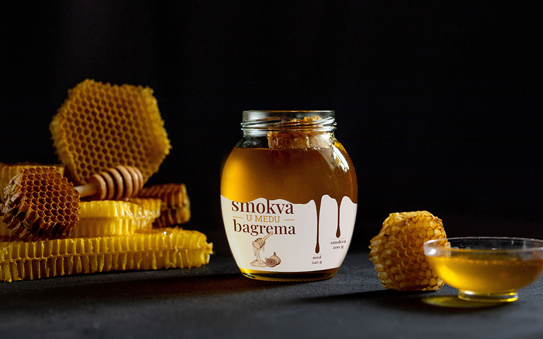
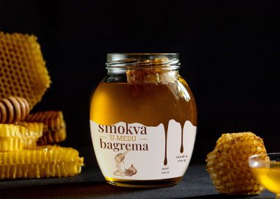
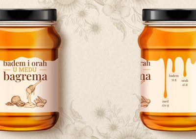
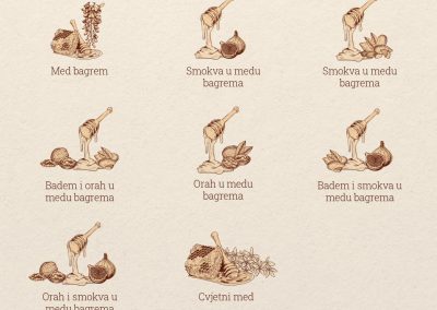
The labels are applied to eight different types of honey, which differ in ingredients and weight.
The main illustration with the title shows the contents of the jar, and the proportions of each ingredient are listed on the side.
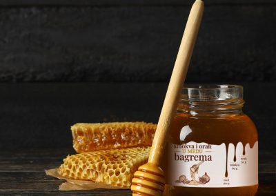
The label is cut in the form of droplets, with the longest drop representing the largest proportion of ingredients and the shortest the smallest. The top is cut in a wavy shape, symbolizing the flowing shape of honey.
Main goal was to “open” the label as much as possible in order to see the inside of the jar, its color and content which are important factors when choosing honey.
